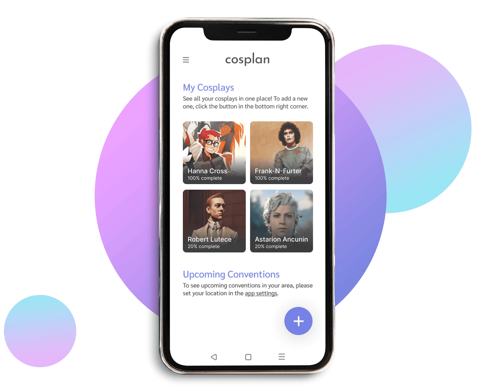
Cosplan
An end-to-end cosplay planning app

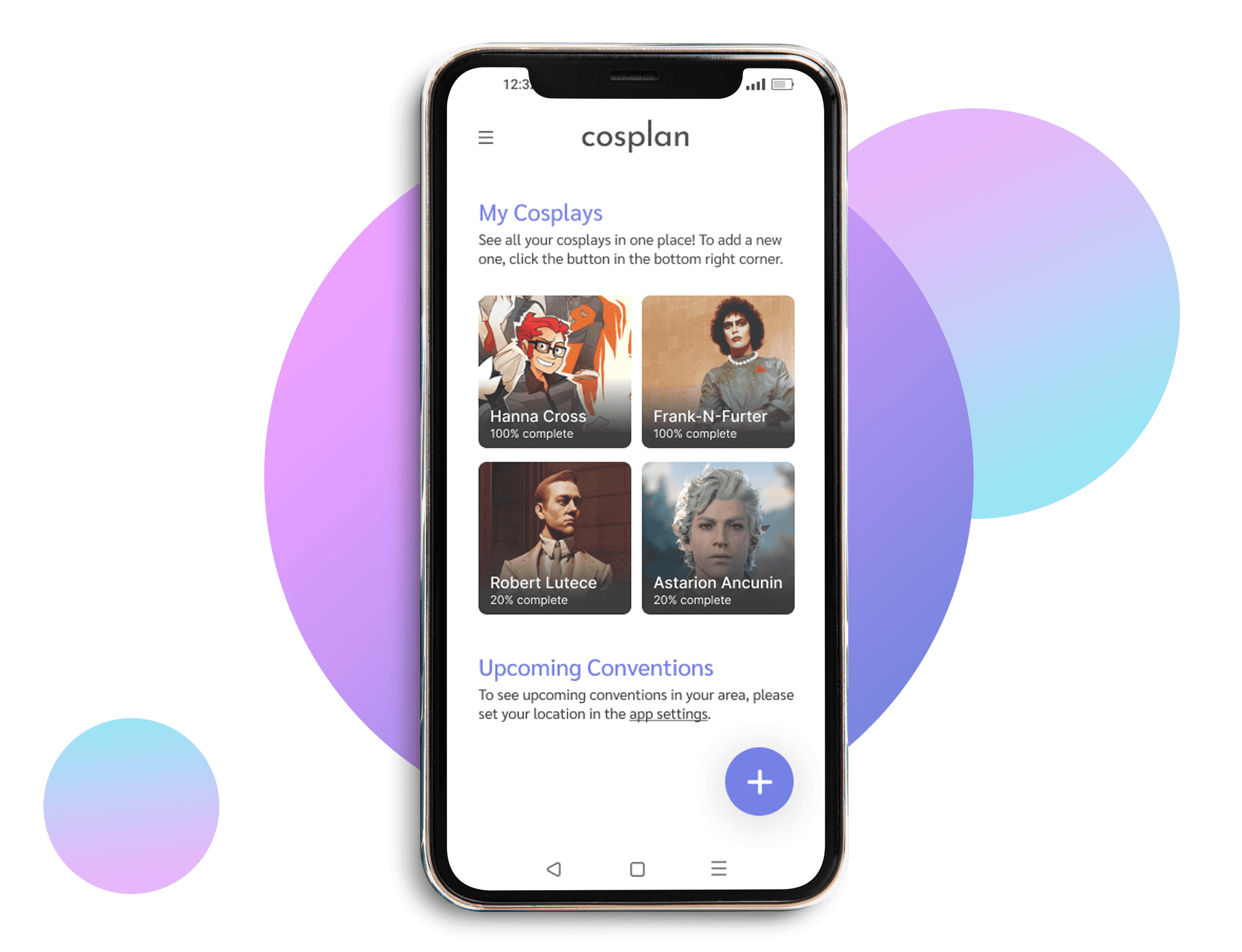
Cosplan
An end-to-end cosplay planning app


Cosplan
An end-to-end cosplay planning app


Cosplan
An end-to-end cosplay planning app


Cosplan
An end-to-end cosplay planning app

My role
My role
My role
My role
UX Research, Product Designer, UI Designer.
UX Research, Product Designer, UI Designer.
UX Research, Product Designer, UI Designer.
Project duration
Project duration
Project duration
Project duration
December 2023 - January 2024
December 2023 - January 2024
December 2023 - January 2024
What's the problem?
What's the problem?
What's the problem?
Originating as a niche subculture, the act of cosplaying (a hobby where individuals dress up as characters from anime, manga, video games, movies, etc) is a global phenomenon, with millions of fans around the world investing time and skill in recreating outfits, accessories, and wigs to bring their favorite characters to life.
Despite the hobby's popularity, there are very few tools or platforms that exist to help cosplayers plan and manage their projects - so what could I build to bridge that gap?

— 01. Research
— 01. Research
Surveying the community
I started off this project with a survey to help understand the challenges cosplayers face when planning their cosplays. The questions that I wanted to explore were:
What frustrations/pinch points do cosplayers have?
How do cosplayers approach the planning of costumes?
Are cosplayers using any existing tools or platforms?
Respondents and their planning habits
The survey ran for a week, and garnered 19 respondents aged between 25-34 with a range of gender identities and cosplay experience. It was designed to explore how cosplayers plan, whether they use existing apps, and how they would rate the importance of specific features for an app of this nature.
Current Habits
Respondents said they use notes apps, Google Docs, Excel Spreadsheets, and handwritten notes to plan.
47% of respondents do not currently track their overall spend on an individual cosplay.
Existing Apps
Only one respondent used an existing app specifically designed for cosplay - Cosplanner.
They liked how simple the app was, and that they could add specific reference images to each costume entry.
They wanted ‘more incentive to keep focused on costume building’ and suggested a notification system.
Essential Features
Respondents considered budgeting, to-do lists, progress tracking, and the ability to organize/upload reference images to be the most important feature.
47% of all users rated a planning tool to be very important.
53% of respondents said having a way to track overall progress was very important, as was a database of recommended suppliers.
36% of users said that a calendar feature for upcoming conventions would be very important to them.
42% of users said that having a way to track their spend on a cosplay was very important.
Analysing Trello and Todoist
The survey provided a lot of information and ideas on what to tackle as the minimum viable product for this project. I ultimately settled on the creation of a tracking and planning app, intending to add in additional features like budget tracking at a later date, so I looked at task management apps rather than cosplay ones.
Exploring Todoist's UI and features
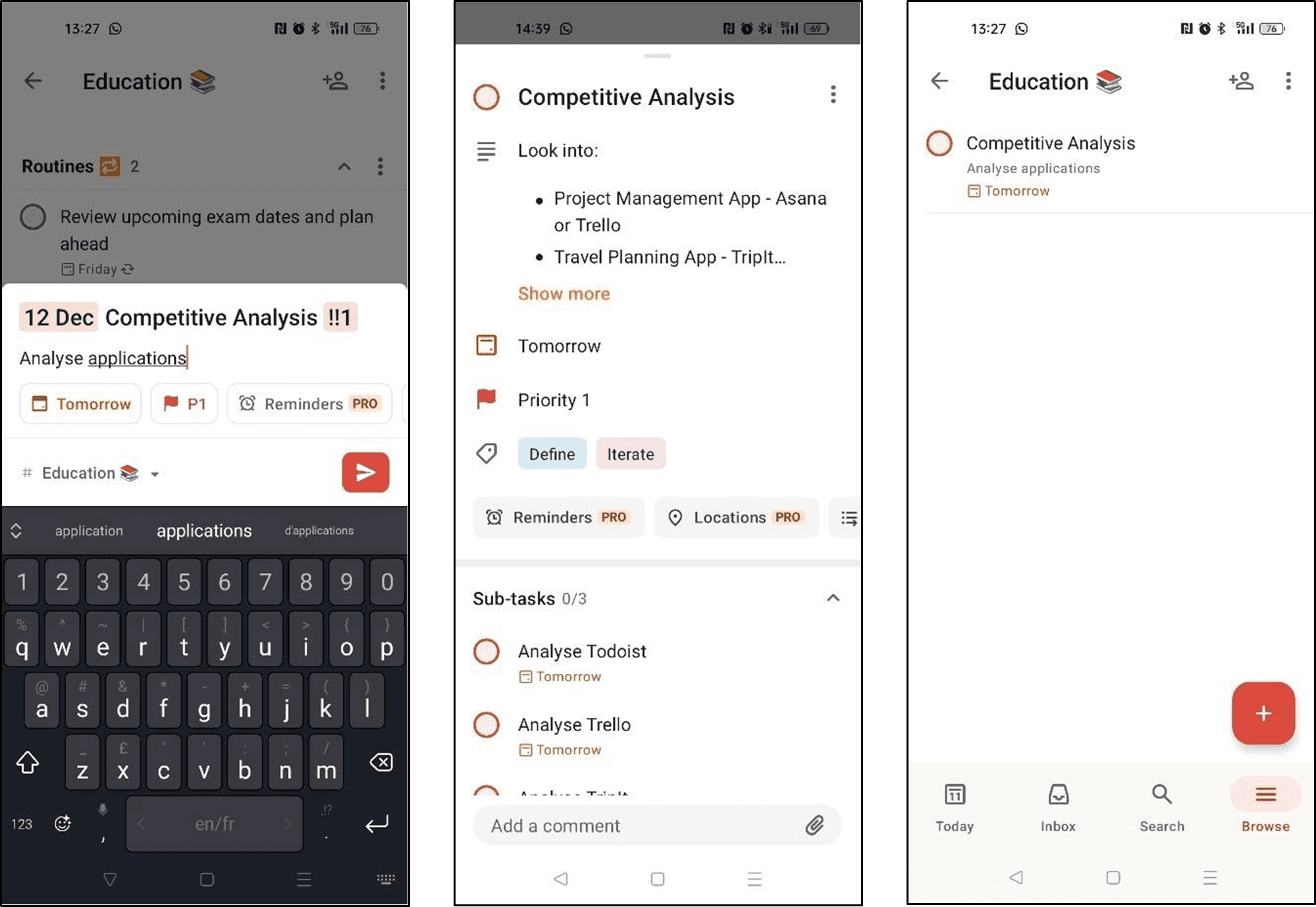
The good…
Simple, clean, user-friendly interface so everything is easy to set up/find.
Easy and intuitive to learn.
Todoist automatically recognizes due dates, priorities, and other details, streamlining the process.
Robust system for prioritizing tasks, assigning due dates, and adding labels.
Todoist allows users to switch between seeing their tasks in a list view (like their notes app) or in a board view.
Includes productivity features such as recurring tasks, reminders, and productivity tracking.
…and the bad
Some features (such as reminders) are premium only so users do have to pay to access key features.
Sub-actions are not named in a way that explains what they do, nor is there an explanation; users have to experiement to work out how they function.
No automation for moving tasks in the board view like Trello has.
Adding a file to a task is less intuitive and required me to Google an answer.
Testing Trello's capabilities
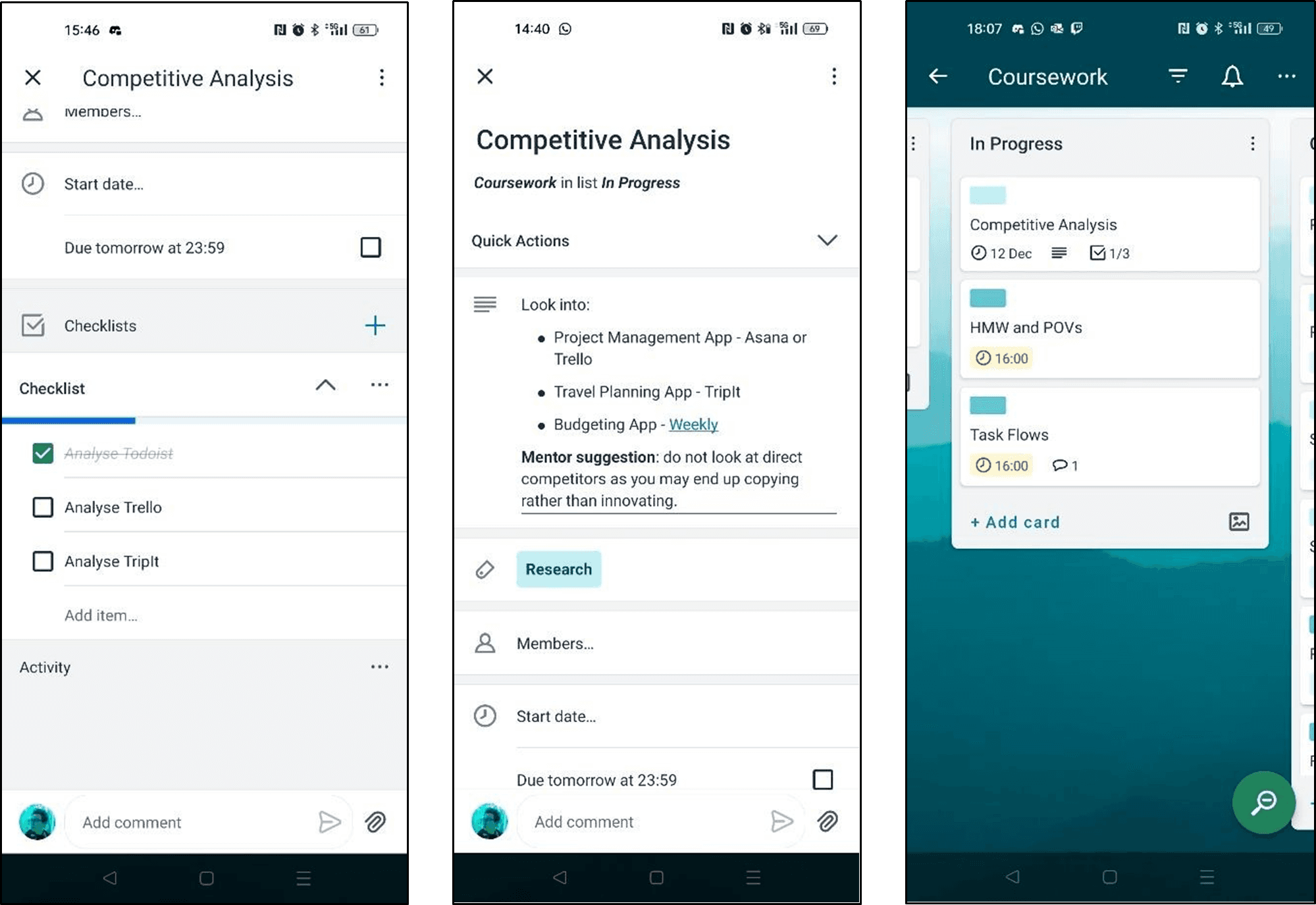
What works for Trello…
Drag-and-drop interface provide a visually intuitive way to organize tasks and projects.
Incredibly easy to learn, and all buttons are easy to find.
The free version of Trello provides all the essential features; premium is mostly cosmetic changes.
Trello includes automation capabilities to help with repetitive tasks and workflows.
…and what doesn't
Trello requires additional plugins or customization for detailed progress tracking, which are a premium feature.
Basic doesn't support task dependencies or intricate relationships between cards.
Offline mode is mobile only; browser and desktop versions require an internet connection.
Labels are coloured dots without a label, meaning users could forget what their label colour means.
Doesn't recognise dates and times automatically, so users must manually create reoccurring tasks.
— 01. Research
Surveying the community
I started off this project with a survey to help understand the challenges cosplayers face when planning their cosplays. The questions that I wanted to explore were:
What frustrations/pinch points do cosplayers have?
How do cosplayers approach the planning of costumes?
Are cosplayers using any existing tools or platforms?
Respondents and their planning habits
The survey ran for a week, and garnered 19 respondents aged between 25-34 with a range of gender identities and cosplay experience. It was designed to explore how cosplayers plan, whether they use existing apps, and how they would rate the importance of specific features for an app of this nature.
Current Habits
Respondents said they use notes apps, Google Docs, Excel Spreadsheets, and handwritten notes to plan.
47% of respondents do not currently track their overall spend on an individual cosplay.
Existing Apps
Only one respondent used an existing app specifically designed for cosplay - Cosplanner.
They liked how simple the app was, and that they could add specific reference images to each costume entry.
They wanted ‘more incentive to keep focused on costume building’ and suggested a notification system.
Essential Features
Respondents considered budgeting, to-do lists, progress tracking, and the ability to organize/upload reference images to be the most important feature.
47% of all users rated a planning tool to be very important.
53% of respondents said having a way to track overall progress was very important, as was a database of recommended suppliers.
36% of users said that a calendar feature for upcoming conventions would be very important to them.
42% of users said that having a way to track their spend on a cosplay was very important.
Analysing Trello and Todoist
The survey provided a lot of information and ideas on what to tackle as the minimum viable product for this project. I ultimately settled on the creation of a tracking and planning app, intending to add in additional features like budget tracking at a later date, so I looked at task management apps rather than cosplay ones.
Exploring Todoist's UI and features

The good…
Simple, clean, user-friendly interface so everything is easy to set up/find.
Easy and intuitive to learn.
Todoist automatically recognizes due dates, priorities, and other details, streamlining the process.
Robust system for prioritizing tasks, assigning due dates, and adding labels.
Todoist allows users to switch between seeing their tasks in a list view (like their notes app) or in a board view.
Includes productivity features such as recurring tasks, reminders, and productivity tracking.
…and the bad
Some features (such as reminders) are premium only so users do have to pay to access key features.
Sub-actions are not named in a way that explains what they do, nor is there an explanation; users have to experiement to work out how they function.
No automation for moving tasks in the board view like Trello has.
Adding a file to a task is less intuitive and required me to Google an answer.
Testing Trello's capabilities

What works for Trello…
Drag-and-drop interface provide a visually intuitive way to organize tasks and projects.
Incredibly easy to learn, and all buttons are easy to find.
The free version of Trello provides all the essential features; premium is mostly cosmetic changes.
Trello includes automation capabilities to help with repetitive tasks and workflows.
…and what doesn't
Trello requires additional plugins or customization for detailed progress tracking, which are a premium feature.
Basic doesn't support task dependencies or intricate relationships between cards.
Offline mode is mobile only; browser and desktop versions require an internet connection.
Labels are coloured dots without a label, meaning users could forget what their label colour means.
Doesn't recognise dates and times automatically, so users must manually create reoccurring tasks.
— 01. Research
Surveying the community
I started off this project with a survey to help understand the challenges cosplayers face when planning their cosplays. The questions that I wanted to explore were:
What frustrations/pinch points do cosplayers have?
How do cosplayers approach the planning of costumes?
Are cosplayers using any existing tools or platforms?
Respondents and their planning habits
The survey ran for a week, and garnered 19 respondents aged between 25-34 with a range of gender identities and cosplay experience. It was designed to explore how cosplayers plan, whether they use existing apps, and how they would rate the importance of specific features for an app of this nature.
Current Habits
Respondents said they use notes apps, Google Docs, Excel Spreadsheets, and handwritten notes to plan.
47% of respondents do not currently track their overall spend on an individual cosplay.
Existing Apps
Only one respondent used an existing app specifically designed for cosplay - Cosplanner.
They liked how simple the app was, and that they could add specific reference images to each costume entry.
They wanted ‘more incentive to keep focused on costume building’ and suggested a notification system.
Essential Features
Respondents considered budgeting, to-do lists, progress tracking, and the ability to organize/upload reference images to be the most important feature.
47% of all users rated a planning tool to be very important.
53% of respondents said having a way to track overall progress was very important, as was a database of recommended suppliers.
36% of users said that a calendar feature for upcoming conventions would be very important to them.
42% of users said that having a way to track their spend on a cosplay was very important.
Analysing Trello and Todoist
The survey provided a lot of information and ideas on what to tackle as the minimum viable product for this project. I ultimately settled on the creation of a tracking and planning app, intending to add in additional features like budget tracking at a later date, so I looked at task management apps rather than cosplay ones.
Exploring Todoist's UI and features

The good…
Simple, clean, user-friendly interface so everything is easy to set up/find.
Easy and intuitive to learn.
Todoist automatically recognizes due dates, priorities, and other details, streamlining the process.
Robust system for prioritizing tasks, assigning due dates, and adding labels.
Todoist allows users to switch between seeing their tasks in a list view (like their notes app) or in a board view.
Includes productivity features such as recurring tasks, reminders, and productivity tracking.
…and the bad
Some features (such as reminders) are premium only so users do have to pay to access key features.
Sub-actions are not named in a way that explains what they do, nor is there an explanation; users have to experiement to work out how they function.
No automation for moving tasks in the board view like Trello has.
Adding a file to a task is less intuitive and required me to Google an answer.
Testing Trello's capabilities

What works for Trello…
Drag-and-drop interface provide a visually intuitive way to organize tasks and projects.
Incredibly easy to learn, and all buttons are easy to find.
The free version of Trello provides all the essential features; premium is mostly cosmetic changes.
Trello includes automation capabilities to help with repetitive tasks and workflows.
…and what doesn't
Trello requires additional plugins or customization for detailed progress tracking, which are a premium feature.
Basic doesn't support task dependencies or intricate relationships between cards.
Offline mode is mobile only; browser and desktop versions require an internet connection.
Labels are coloured dots without a label, meaning users could forget what their label colour means.
Doesn't recognise dates and times automatically, so users must manually create reoccurring tasks.

— 02. Define
— 02. Define
— 02. Define
Understanding the problem
Understanding the problem
Understanding the problem
After completing my competitive analysis and looking at my survey results, I moved on to my How Might We (HMW) questions and Point Of View (POV) statements to help me further understand pinch points and craft a solution.
After completing my competitive analysis and looking at my survey results, I moved on to my How Might We (HMW) questions and Point Of View (POV) statements to help me further understand pinch points and craft a solution.
After completing my competitive analysis and looking at my survey results, I moved on to my How Might We (HMW) questions and Point Of View (POV) statements to help me further understand pinch points and craft a solution.
The cosplayer's Point of View
The cosplayer's Point of View
The cosplayer's Point of View
Cosplayers need a way in which to plan their cosplays and track progress so that they can easily see what needs to be done and prioritize their time.
Cosplaying is an expensive hobby, with lots of materials and parts to be bought to complete each costume.
Cosplayers need an easy way to discover upcoming conventions.
Questioning the solution
How might we provide cosplayers with a tool to track progress, allowing them to easily see outstanding tasks and manage their time effectively?
How might we help cosplayers track their overall spending on individual cosplays?
How can we create a simple tool for cosplayers to find and access information about upcoming conventions?
Crafting target user profiles
Crafting target user profiles
Crafting target user profiles
Thinking about my POV statements and HMW questions alongside survey results, I narrowed down the main features of the app that I wanted to look into, and created two personas to help me create the final product.
Thinking about my POV statements and HMW questions alongside survey results, I narrowed down the main features of the app that I wanted to look into, and created two personas to help me create the final product.
Thinking about my POV statements and HMW questions alongside survey results, I narrowed down the main features of the app that I wanted to look into, and created two personas to help me create the final product.

Seasoned Cosplayer
Seasoned Cosplayer
Seasoned Cosplayer
30 · Female · Costume Designer
30 · Female · Costume Designer
30 · Female · Costume Designer
Pinch points
Meredith, our seasoned cosplayer, is often working on multiple costumes at once - both for work and for her hobby as a cosplayer, so can sometimes get overwhelmed with how much she needs to do and working out the steps involved.
Meredith, our seasoned cosplayer, is often working on multiple costumes at once - both for work and for her hobby as a cosplayer, so can sometimes get overwhelmed with how much she needs to do and working out the steps involved.
Meredith, our seasoned cosplayer, is often working on multiple costumes at once - both for work and for her hobby as a cosplayer, so can sometimes get overwhelmed with how much she needs to do and working out the steps involved.
Goals for using the product
User Goals
A way to streamline the planning process and organize her workflow.
A way to streamline the planning process and organize her workflow.
A way to streamline the planning process and organize her workflow.
User needs
Advanced cosplay planning tools.
A to-do list to easily visualise what needs to be done.
Advanced cosplay planning tools.
A to-do list to easily visualise what needs to be done.
Advanced cosplay planning tools.
A to-do list to easily visualise what needs to be done.
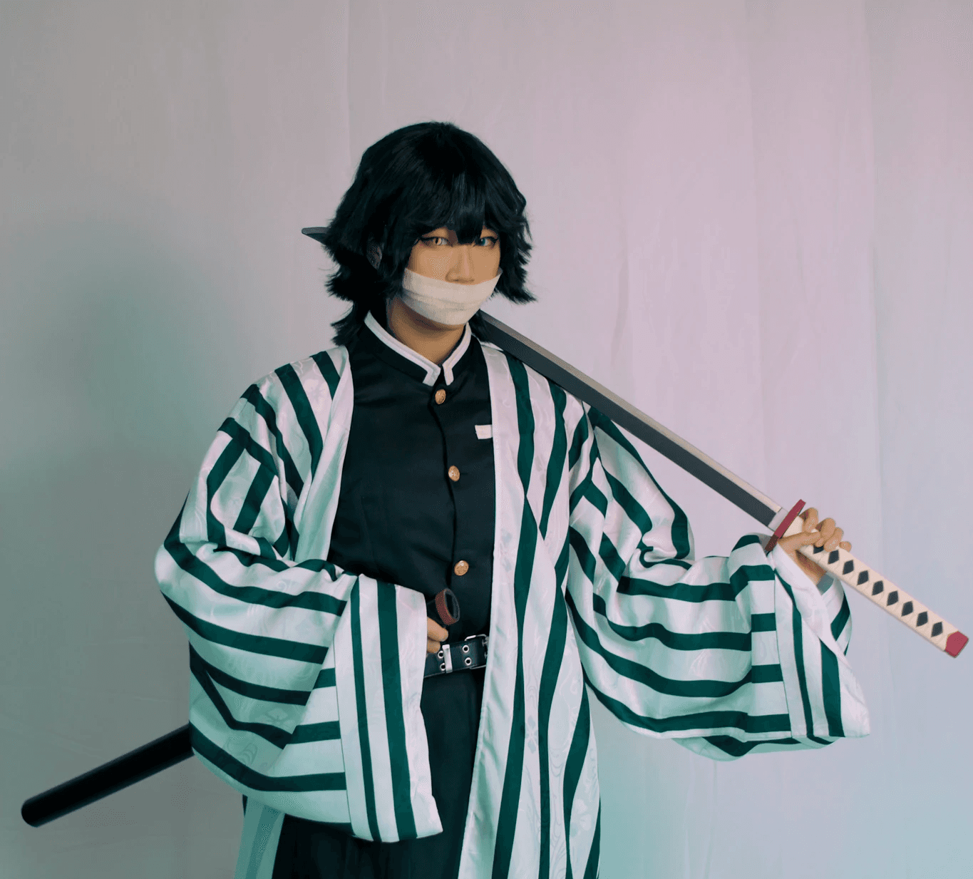

Casual Cosplayer
Casual Cosplayer
25 · Non-Binary · Marketing Coodinator
25 · Non-Binary · Marketing Coodinator
25 · Non-Binary · Marketing Coodinator
Pinch points
Jordan, our casual cosplayer, has tried other apps but hasn't gelled with any as they need something more simple that still balances essential features.
Jordan, our casual cosplayer, has tried other apps but hasn't gelled with any as they need something more simple that still balances essential features.
Jordan, our casual cosplayer, has tried other apps but hasn't gelled with any as they need something more simple that still balances essential features.
Goals for using the product
User Goals
To find an app for casual cosplay planning without an overwhelming interface.
To find an app for casual cosplay planning without an overwhelming interface.
To find an app for casual cosplay planning without an overwhelming interface.
User needs
Easy-to-use costume planning and organization tools.
Notification features for upcoming local cosplay events.
Easy-to-use costume planning and organization tools.
Notification features for upcoming local cosplay events.
Easy-to-use costume planning and organization tools.
Notification features for upcoming local cosplay events.
Exploring my task flow
Exploring my task flow
Exploring my task flow
I prioritized designing a task flow based on the the main feature I wanted the app to have: a task list that users could add to and check off so that they could visualise and track their progress. This enabled me to think about all the screens I would need to create, and the way the process would flow from one part to another.
I prioritized designing a task flow based on the the main feature I wanted the app to have: a task list that users could add to and check off so that they could visualise and track their progress. This enabled me to think about all the screens I would need to create, and the way the process would flow from one part to another.
I prioritized designing a task flow based on the the main feature I wanted the app to have: a task list that users could add to and check off so that they could visualise and track their progress. This enabled me to think about all the screens I would need to create, and the way the process would flow from one part to another.


— 03. Design
— 03. Design
— 03. Design
The first pass - rough low-fidelity sketches
The first pass - rough low-fidelity sketches
The first pass - rough low-fidelity sketches
In order to get my thoughts more in order with the UI, I drew some very rough sketches to plan out how the main pages would look, as well as writing quick notes on how I imagined various buttons working. The key thing I wanted to include was a FAB button, so that users could quickly add tasks and plans to the app.
In order to get my thoughts more in order with the UI, I drew some very rough sketches to plan out how the main pages would look, as well as writing quick notes on how I imagined various buttons working. The key thing I wanted to include was a FAB button, so that users could quickly add tasks and plans to the app.
In order to get my thoughts more in order with the UI, I drew some very rough sketches to plan out how the main pages would look, as well as writing quick notes on how I imagined various buttons working. The key thing I wanted to include was a FAB button, so that users could quickly add tasks and plans to the app.
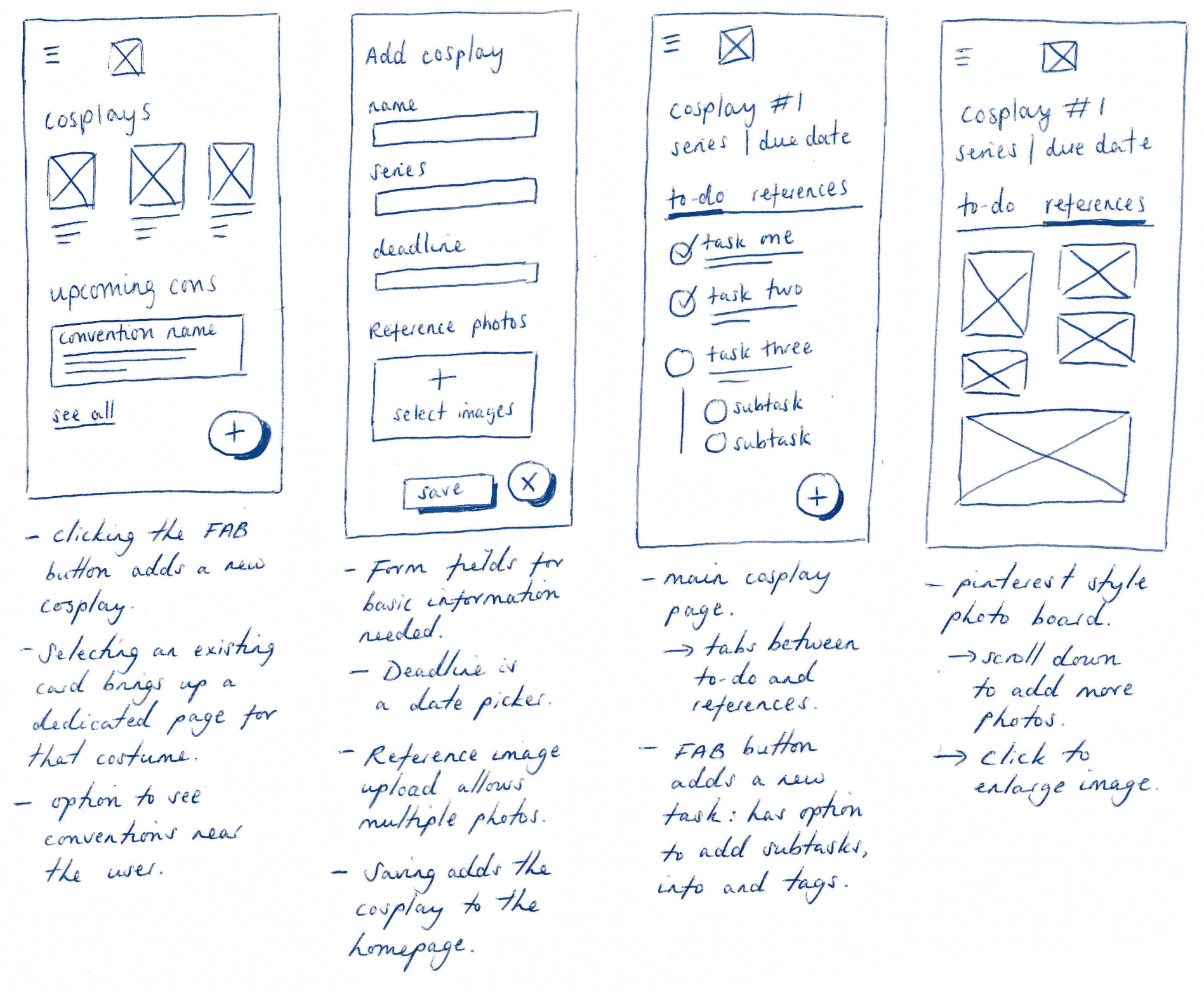
I also thought about another feature that users had expressed interest in, which was a way to see the upcoming conventions in the area. I envisioned this sitting in the main homepage, where it would update based on the location of the device being used.
The set of sketches on the left show how I was envisioning the pinned option to work. I originally considered a pop-up, similar to the way Twitter functioned, but after more research
The set of sketches on the left show how I was envisioning the pinned option to work. I originally considered a pop-up, similar to the way Twitter functioned, but after more research
Creating High-Fidelity Prototypes: simplicity is key
Creating High-Fidelity Prototypes: simplicity is key
Creating High-Fidelity Prototypes: simplicity is key
I decided to keep the visual branding simple so that I could focus more on the UI design. I wanted to make sure that the layout was clean but appealing, and that each step was intuitive to users when it came to testing.
I decided to keep the visual branding simple so that I could focus more on the UI design. I wanted to make sure that the layout was clean but appealing, and that each step was intuitive to users when it came to testing.
I decided to keep the visual branding simple so that I could focus more on the UI design. I wanted to make sure that the layout was clean but appealing, and that each step was intuitive to users when it came to testing.
During the survey, users mentioned that they wanted a way in which to organise their tasks, so the easiest method to provide this was to create a task list that could be added to.
Each task has the ability to add subtasks, meaning pieces of work can be broken down into manageable chunks.
Addition of a progress bar to allow users to visualise how far through the project they are.
A tab for uploading references so users can keep all of their photos and inspiration in one place.
FAB button for a quick and easy way to add a new project, or to add tasks to an existing one.

— 04. Test
— 04. Test
— 04. Test
Testing the product with users
Testing the product
Testing the product with users
Testing the product
The test group comprised of 6 individuals between the ages of 23 and 35, who had varying levels of experience in cosplaying. Some were closet cosplayers, some occasional, and some frequent cosplayers. The testing process involved assessing the visual layout, intuitiveness of the task flows, and ease of use. Additionally, the test evaluated whether users were able to comprehend the correlation between the progress bar and the time left, their preference for the progress bar, and their willingness to use a filter system for tasks.
The test group comprised of 6 individuals between the ages of 23 and 35, who had varying levels of experience in cosplaying. Some were closet cosplayers, some occasional, and some frequent cosplayers. The testing process involved assessing the visual layout, intuitiveness of the task flows, and ease of use. Additionally, the test evaluated whether users were able to comprehend the correlation between the progress bar and the time left, their preference for the progress bar, and their willingness to use a filter system for tasks.
The test group comprised of 6 individuals between the ages of 23 and 35, who had varying levels of experience in cosplaying. Some were closet cosplayers, some occasional, and some frequent cosplayers. The testing process involved assessing the visual layout, intuitiveness of the task flows, and ease of use. Additionally, the test evaluated whether users were able to comprehend the correlation between the progress bar and the time left, their preference for the progress bar, and their willingness to use a filter system for tasks.
The tasks to complete
To use the app to create a new cosplay from the homepage.
To then add a new task to the cosplay’s empty to-do list.
To upload reference images on to the cosplay’s to-do list.
To interact with the task list to tick things off.
To use the app to create a new cosplay from the homepage.
To then add a new task to the cosplay’s empty to-do list.
To upload reference images on to the cosplay’s to-do list.
To interact with the task list to tick things off.
To use the app to create a new cosplay from the homepage.
To then add a new task to the cosplay’s empty to-do list.
To upload reference images on to the cosplay’s to-do list.
To interact with the task list to tick things off.
The results proved I was going in the right direction!
The results proved I was going in the right direction!
The results proved I was going in the right direction!
All users were able to complete each task in full in under five minutes, without errors or guidance.
Visual design was described as clean and easy to understand.
Task flows were reportedly ‘intuitive’ and worked as testers expected, playing into existing mental models.
Majority of users liked the progress bar to aid in visually tracking how far through a project they were.
All users were in favour of a way to filter tasks by date and label.
Testers were pleasantly surprised by the addition of the subtask checklist.
On a scale from 1 to 5 (1 being unlikely to use, and 5 being very likely to use) majority rated it at a 4 or above.
Nothing is perfect - testing showed some improvements to be made
Nothing is perfect - testing showed some improvements to be made
Nothing is perfect - testing showed some improvements to be made
Nothing is perfect - testing showed some improvements to be made
While results of the testing were overwhelmingly positive, there were a couple of changes that were suggested by the testers and some things I noticed myself when conducting the usability tests. Additionally, speaking to my mentor on the project raised some additional things to iterate on, such as on-screen visual feedback to confirm the success of creating a task or adding a cosplay, a way to filter tasks based on deadline or tags, and suggestions to relabel some elements so that they're clearer for users.
While results of the testing were overwhelmingly positive, there were a couple of changes that were suggested by the testers and some things I noticed myself when conducting the usability tests. Additionally, speaking to my mentor on the project raised some additional things to iterate on, such as on-screen visual feedback to confirm the success of creating a task or adding a cosplay, a way to filter tasks based on deadline or tags, and suggestions to relabel some elements so that they're clearer for users.
While results of the testing were overwhelmingly positive, there were a couple of changes that were suggested by the testers and some things I noticed myself when conducting the usability tests. Additionally, speaking to my mentor on the project raised some additional things to iterate on, such as on-screen visual feedback to confirm the success of creating a task or adding a cosplay, a way to filter tasks based on deadline or tags, and suggestions to relabel some elements so that they're clearer for users.

— 05. Iterate
— 05. Iterate
— 05. Iterate
Final Prototypes; amending and refining the product
Final Prototypes; amending and refining the product
Final Prototypes; amending and refining the product
With the feedback from the usability test participants in mind, I went back to my original prototype and worked on the changes to ensure that the final product was as polished as possible. The videos below showcase the final prototypes but if you'd like to test them yourself try this Figma link.
With the feedback from the usability test participants in mind, I went back to my original prototype and worked on the changes to ensure that the final product was as polished as possible. The videos below showcase the final prototypes, but if you'd like but if you'd like to test them yourself try this Figma link.
With the feedback from the usability test participants in mind, I went back to my original prototype and worked on the changes to ensure that the final product was as polished as possible. The videos below showcase the final prototypes, but if you'd like but if you'd like to test them yourself try this Figma link.
Adding a Cosplay
Adding a Cosplay
Adding a Cosplay
Feedback was really positive for this flow, but there were a few things visually that I wanted to improve, such as:
Feedback was really positive for this flow, but there were a few things visually that I wanted to improve, such as:
Feedback was really positive for this flow, but there were a few things visually that I wanted to improve, such as:
Cleaning up the grid display to make it more streamlined; the title and progress moved from below the photo to on top, with a gradient fade to keep the text visible.
Remaking the entire input form and fields to match the UI on other pages for consistency across screens.
Adding visual feedback to let users know their changes had been saved.
Adding a Task
Adding a Task
Adding a Task
Remaking the input field form.
Added a date picker to simulate how a live app would function
Removing the cancel buttons and adding an x to close button, along with a cancellation modal.adding
Adding filter option to the main task list, as user feedback requested.
Amending the label on the progress bar to show the amount of tasks done vs still to do, rather than showing a percentage.
Adding References
Adding References
Adding References
This flow stayed the same from my first iterations, with some minor adjustments; as with the add a task flow, I removed the cancel button in favour of an x to close, and added a cancellation modal.
This flow stayed the same from my first iterations, with some minor adjustments; as with the add a task flow, I removed the cancel button in favour of an x to close, and added a cancellation modal.
This flow stayed the same from my first iterations, with some minor adjustments; as with the add a task flow, I removed the cancel button in favour of an x to close, and added a cancellation modal.
Additional changes to the final protoype
Additional changes to the final protoype
Additional changes to the final protoype
In addition to the above changes, I also added a page to demonstrate how clicking into a task would give you the ability to see all the details and make changes, added an example of how a user would go about deleting a subtask, should it be needed, and added an icon to demonstrate that there would be a filter function (though I did not get around to prototyping this).
In addition to the above changes, I also added a page to demonstrate how clicking into a task would give you the ability to see all the details and make changes, added an example of how a user would go about deleting a subtask, should it be needed, and added an icon to demonstrate that there would be a filter function (though I did not get around to prototyping this).
In addition to the above changes, I also added a page to demonstrate how clicking into a task would give you the ability to see all the details and make changes, added an example of how a user would go about deleting a subtask, should it be needed, and added an icon to demonstrate that there would be a filter function (though I did not get around to prototyping this).

— 06. Conclusion
— 06. Conclusion
— 06. Conclusion
Next steps and what I'd do differently
Next steps and what I'd do differently
Next steps and what I'd do differently
The project had a 74 hour turnaround, which meant that I did have time against me. With a little bit longer, my next step would be to fully prototype the filter function and run a second round of usability tests to see how users responded to the changes made.
The project had a 74 hour turnaround, which meant that I did have time against me. With a little bit longer, my next step would be to fully prototype the filter function and run a second round of usability tests to see how users responded to the changes made.
The project had a 74 hour turnaround, which meant that I did have time against me. With a little bit longer, my next step would be to fully prototype the filter function and run a second round of usability tests to see how users responded to the changes made.
If I were to try this project again from the beginning, however, the main thing that I would do differently would be to refer more to the survey results and consider ways in which to add other features to the base app; I believe I focused a little too much on the planning and progress tracking aspect, and I wish that I had devoted a bit more time to other key features like the budget tracker, or the convention calendar that survey respondents mentioned being important. Despite this, I found the challenge enjoyable, and I believe the product would still be useful for cosplayers - something backed up by one of my testers telling me that they wished the app was real!
If I were to try this project again from the beginning, however, the main thing that I would do differently would be to refer more to the survey results and consider ways in which to add other features to the base app; I believe I focused a little too much on the planning and progress tracking aspect, and I wish that I had devoted a bit more time to other key features like the budget tracker, or the convention calendar that survey respondents mentioned being important. Despite this, I found the challenge enjoyable, and I believe the product would still be useful for cosplayers - something backed up by one of my testers telling me that they wished the app was real!
If I were to try this project again from the beginning, however, the main thing that I would do differently would be to refer more to the survey results and consider ways in which to add other features to the base app; I believe I focused a little too much on the planning and progress tracking aspect, and I wish that I had devoted a bit more time to other key features like the budget tracker, or the convention calendar that survey respondents mentioned being important. Despite this, I found the challenge enjoyable, and I believe the product would still be useful for cosplayers - something backed up by one of my testers telling me that they wished the app was real!